Design System for Building Mobile Applications
Description
This design system was created for teams building products in the AI era, where scalability and adaptability are essential. We designed it to support long-term product growth, consistent user experiences, and multi-theme interfaces from the start.
Background
After contributing to dozens of products, including large enterprise projects, we noticed that interface development was taking far more time than it should.
Poor delivery is not always the fault of designers alone or developers alone — in most cases, both sides contribute to the problem.
On the design side
- Common issues include inconsistent rhythm, contrast, grids, spacing, and scale rules. What looks polished in Figma often turns out differently in code.
- Components are not brought to a true product-ready level, with missing states and incomplete behavior.
- Variants begin to spread, and duplication grows — the same element ends up being designed in multiple different ways.
On the development side
- Teams often create unnecessary chaos in the codebase, especially when the team is small and there is little time for proper code review.
- AI-assisted coding can make this even worse: everyone generates code differently, rewrites each other’s work, and gradually drifts away from a shared style and architecture.
- UI is often built screen by screen instead of through reusable components, which increases both code volume and the number of bugs.
- Multi-theme support becomes especially expensive when the system is not token-based from the start, often requiring major rewrites later.
All of this leads to more bugs, repeated rework, slower feature delivery, and increasingly difficult maintenance and scaling.
And these issues concern interface development alone — even before considering business logic, data handling, or other product complexity. In our view, business logic is highly custom and varies from project to project. Interfaces are different.
Interfaces can be built quickly, with high quality, and even accelerated with AI — but only when both the interface itself and the development process are properly systematized.
Other Design Systems
While creating our design system, we studied dozens of mature systems, including
- EPAM Design System
- Material UI
- Hero UI
- Untitled UI
- And many others
Across all of them, we found certain limitations that did not fully match our standards or product needs. For example, some systems relied on custom values instead of tokens, while others offered limited typography customization.
By analyzing the strengths and weaknesses of existing solutions and combining that with our own practical experience, we created a design system tailored to scalability, consistency, and flexibility.
AI Era
Today, tools like Cursor make it easy to generate UI quickly. But speed is not the main challenge. The real challenge is creating code that is maintainable, reusable, and system-driven.
- Without a clear design and development framework, AI continuously makes isolated local decisions that add up to technical debt.
- The result is code that may work for a single screen, but fails to scale across the product.
- Without strong rules in place, AI cannot ensure visual rhythm, consistency, or a cohesive user experience.
What We’re Building
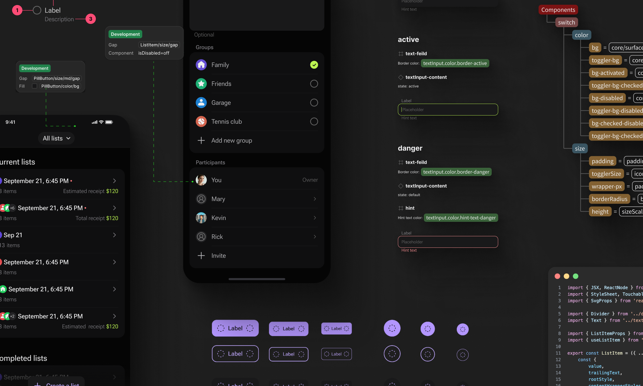
- Figma Design System — a strict system of tokens, themes, and components
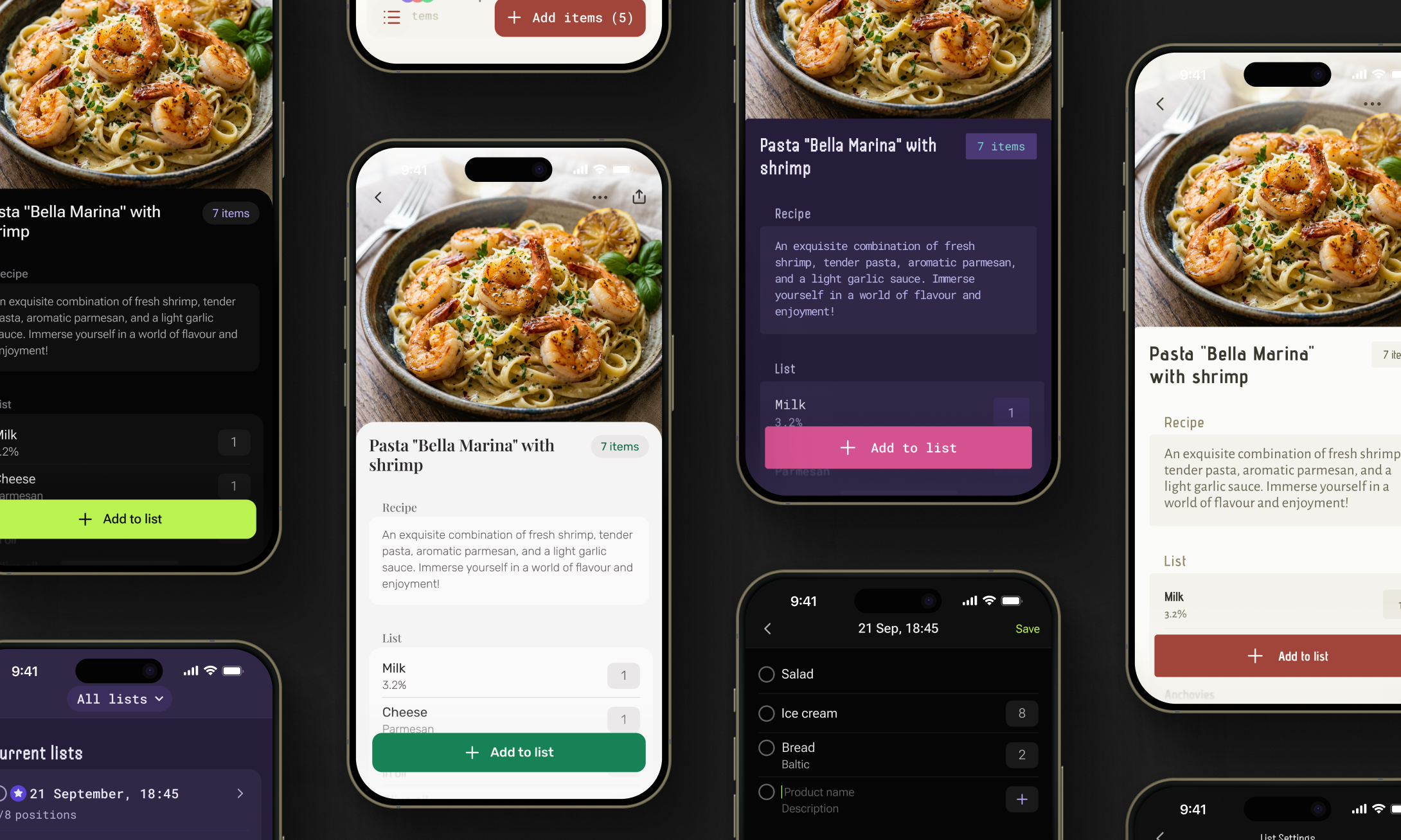
- React Native UI Kit — production-ready, highly functional components available via npm
- MCP Server + Cursor Skill — AI-powered screen assembly using existing components and tokens
We are not trying to replace Cursor — we are giving it a strict framework of rules, tokens, and component libraries so it does not invent new code every time, but instead assembles interfaces in a correct and predictable way.
Our focus is not on AI itself, since modern models already perform well. Our focus is on turning the design system into a set of technically executable constraints within which AI can operate reliably and consistently.
We are not selling the speed of writing code. We are selling the speed of making changes. We do not generate UI from scratch — we assemble it the right way.
Design System
At the core of the product is a strict design system built around five collections:
- Primitives — foundational tokens with no business-specific meaning
- Sizes — a semantic sizing system for interface elements
- Typography — semantic typography themes with font families and configurable parameters
- Themes — semantic color themes, including both core and alias tokens
- Components — tokens that connect themes, sizes, and typography to real UI elements
We have already developed 20 highly functional components — and when we say highly functional, we mean it.
For example, even a single Button component includes the following attributes:
- Variant
- Solid
- Flat
- Ghost
- Size
- Sm
- Md
- Lg
- Color
- Primary
- Secondary
- Neutral
- Danger
- Disabled State
- Lading Icon
- Trailing Icon
- Loading
- Icon Only
Because the design system is built on three semantic layers, it allows independent customization of color themes, typography themes, and rhythm and radius settings. This means teams can define which fonts to use, configure each of them in detail, and adjust spacing and corner styles — whether the interface should feel more rounded or more sharp and structured.
All of this is designed to give product teams maximum flexibility when creating custom components, while still keeping everything connected to tokens. As a result, they can develop multiple visual directions for the same product at the same time — without losing consistency, scalability, or system control.
What Designer Gets
- Designers can create interfaces within a strict system of rhythm, contrast, and consistency — while still having the flexibility to configure those rules when needed.
- More than 20 highly functional ready-made components are already available, including molecules and organisms, with 30 more coming soon.
- Every screen can be designed with multi-theme support from the start. In just a couple of clicks, designers can switch between:
- color themes
- typography themes
- size themes, including border radius and spacing settings
- The system also gives designers the freedom to create their own custom themes or components when needed.
What Developers Get
- The UI kit is delivered through npm, making it easy to integrate into a project from the start.
- Teams get immediate access to 20+ highly functional components, ready to use in production.
- Through the ThemeProvider, they can work with the full set of semantic tokens for sizing, color, and typography — making it easier to customize existing components, create new ones, and extend or refine current themes.
- Because the components are already tested, teams can accelerate development, simplify QA, and reduce the risk of UI-related issues..
How AI Layer Works
Design System Rules → Figma Frame → MCP Extraction → Cursor Skill → Component Matching → Tokenized RN Layout → Validation → Merge
How to Use Our Design System
Contact us to learn more. Our design system is currently available on a limited-access basis, and we can tailor it to fit your product, workflows, and brand requirements.
